TIME TO LOOK
- brings together more than 60 paintings made by Suzanne Baker dating from 1998 to the present.
In the following conversation with Matt Lippiatt, Baker discusses the stories behind some of the works included in the exhibition.
Suzanne Baker: This exhibition is an overview of what I’ve been doing over the last twenty odd years. Many of the paintings haven’t been exhibited for a while so it’ll be great to see them back on a gallery wall. I also think that you learn a lot about your own work when you see an overview.
Matt Lippiatt: There’s a variety of approaches here. Would you say there’s a bit of everything you’ve been doing during that time?
SB: Yes, more or less. For example, Andaluz Landscape - I remember starting that from life, painting what I could see, and then gradually reducing the painting hugely and working from memory. It was inspired by being there, but in the end I prefer what happens when I let go of the literal view and become more emotionally connected with what I’m trying to paint. It took me a long time to fully understand that.
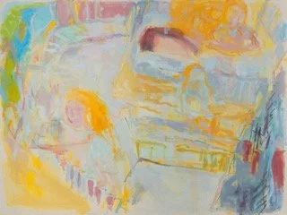
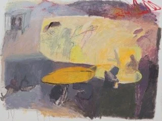
Five Flights from the Kitchen 2021
For Five Flights from the Kitchen, I never drew the space from observation, but I lived in that house for nine years. Later, I found I could remember enough to put it on canvas. I’m painting my memory and feeling about a certain situation.
On the left, a figure climbs the stairs holding a tray. That rectangle at the bottom is the floor of the kitchen, and to the right, that’s outside - there’s a railing, a road, a bus. In the top left, you see blue and green. That’s the other side of the house, the garden is out there. Some of the colours reference reality but none of them are naturalistic. I choose colours because I like them, and because they resonate somehow.
ML: In observational drawing classes there’s a popular dictum: “Paint what you see, not what you know”. In a way you’re flipping that, aren’t you? You know from memory that there are stairs, you know there’s a road, and so on, so you put them into the picture, often without direct observation.
SB: Yes, and in the end I think it’s about whether it satisfies me compositionally. I try a lot of versions, letting go of most of them, “That’s not it, that’s not it…”. The impetus of the original memory is real, and if someone else can’t see it, I don’t mind.
ML: The titles also give us clues.
SB: Sometimes the title aids comprehension of what’s going on, but hopefully you can get something from the painting even without that knowledge. For me, Five Flights from the Kitchen is joyful. I want it to be upbeat and I want that positivity to come across directly. Then, if people are interested they might start to think about what’s happening in the picture.
A Sense of Entitlement carries a different feeling; it’s slightly menacing, I think. There’s the fact that she’s got nothing on, with a male figure following her. I kept him very vague because I didn’t feel that I needed to cross the t’s and dot the i’s. Generally, I find the more I edit the image, the more I like it. I might put everything in at the beginning and then start removing details until I’m left with the essence of what I’m trying to do. As long as I still like the picture as a painting, then I’m happy with it.
I start with a particular memory, and because it’s a memory it is focussed on the most significant details. In A Sense of Entitlement, it’s the stairs, and somebody coming behind. The place is somewhere I used to live, a Victorian block of flats with the staircase open to the elements. This picture represents something I felt, climbing the stairs to my front door, although of course I wasn’t naked, but that’s the feeling. The muted colours are because it’s not a very nice memory.
I went back there and drew that staircase. I felt I had to, so that’s a sort of research, but the painting is about the memory. And with a painting like Five Flights from the Kitchen, I couldn’t go back to that house anyway.
ML: Which paintings contain the oldest memories?
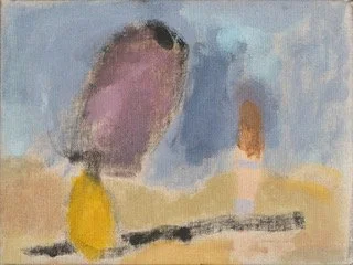
Why? 2019
SB: The painting titled Why? is based on an old memory. It’s about sitting on a bench in front of the sea with this man who was clearly dominant - that big head and the yellow jumper. Again, it’s not particularly cheerful, but it’s a strong memory. I remember what he was saying, and it’s negative.
ML: What does the title refer to?
SB: He was my boyfriend. I wanted to stop seeing him, but he was very unhappy about that. He couldn’t accept it and I was manipulated. So, the why in the title is, why everything? Why was I so intimidated? Why, why, why? But how it is colour wise, I really like. I don’t look at it and go back to being fifteen. I’m satisfied with the picture.
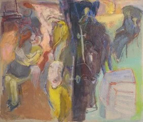
ML: In at the Deep End is one of the earlier paintings in the exhibition, and relatively large.
SB: I began the painting in 1999 when I had a bigger studio. Initially I was working from Botticelli’s The Birth of Venus, but I didn’t like how it was going so I put it aside. It was rolled up in my studio for years. Then I unrolled it and did this.
Probably most of the first painting is covered over, but you can still see the shape of Botticelli’s shell and figures. A lot of the time I worked on it upside down. Sometimes I didn’t know if I preferred it upside down, because I wanted to get away from being literal. I was taking my cue from some of the colours, and I was enjoying the paint. I found it very freeing to make, and I still really like this painting.
One of the things about showing all these paintings together is that I think it’s going to help me to be more free, to be looser, more abstract. That appeals to me.
ML: There are two versions of Drama on the Central Line. The colour and dimensions are different, but the image is broadly the same in both.
SB: I sometimes paint the same memory on more than one canvas at a time, to see which one works out best. In the end I didn’t reject either of these.
The memory in Drama on the Central Line comes from when I was working at Condé Nast, in Oxford Circus. In my lunch hour I went to Notting Hill to buy a big two-and-a-half litre pot of house paint - not for art, just for decorating. On the way back I was sitting on the tube with the pot on my lap, and when the train arrived at Oxford Circus I stood up and dropped it on the floor. The lid came off and it flew all over the place, including on the people opposite me. I didn’t know what to do. It was so shocking.
I got out of the carriage, trying to get the attention of railway staff, but the doors closed behind me and the train left the station. There was nothing I could do to help, so I had to just walk out of the station leaving footprints behind me. For days after I saw those footprints every time I went through Oxford Circus station. The paint in that incident was green, but I’ve used artistic licence and made the paint red in these pictures.
ML: Sometimes you paint variations on an image, but title each variation differently. For example, Rose Tinted Spectacles? and Yellow Sundress.
SB: Unusually for me, those two paintings started with a photograph. It’s me on a tricycle, although I don’t actually remember that happening. I wanted to make self portraits for each decade of my life. Not literal portraits of my face, but images that showed what I was doing in each decade.
Loving It is different. That’s painted from a memory, not a photograph. The figure on the left is my mother-in-law, and the figure on the right is me. I had very long hair like that. She had two sons and no daughters, and she loved to have her hair combed. My mum couldn’t stand to have anyone touch her hair, they were very different. My mother in law would ask me to comb her hair, she said that it made her purr.
ML: When you’re not painting from personal memories, you sometimes paint mythological subjects.
SB: Yes. There are several paintings here based on the myth of Callisto and Arcas, from Ovid’s Metamorphoses. Callisto was the favourite nymph of the goddess Diana, but Callisto becomes persona non grata when she falls pregnant. Jupiter has raped her. The nymphs were supposed to be chaste so to be pregnant was shaming. The story is thousands of years old, but the themes are relevant today.
There are still places where women are beaten to death for being pregnant, and the man takes no responsibility. I made this series of paintings relating to Callisto’s story, as a sequence. Some of the titles are direct quotations from Ovid.
In the painting, And Poured into the Roots of his Teeth, Callisto is alone, asleep in woodland and Jupiter is approaching her in the form of Diana; he’s lusting after her and has metamorphosed to appear female, so as not to frighten her away. In Jupiter seducing Callisto I’ve put a dress on Jupiter as a visual clue of the apparent sex change. He rapes her. It’s a dreadful story. Titian, and other male painters from centuries ago, put a different emphasis on the whole story. In the painting Tricked, that title is my word - she’s been tricked. The pink figure leering at her has a shadow behind it, representing what it really is, that he is male. Another painting, titled Callisto Woke to a Voice, represents the same incident.
In A Boy, Arcas, Callisto has had her baby. She’s in the woods and in the background there is someone spying on her. It’s Diana, angry and jealous because Callisto has had a child with Diana’s husband. She blames Callisto for unbalancing Jupiter. It’s so twisted. Diana transforms Callisto into a bear, in retaliation. That’s what’s happening in The Goddess nips off her Speech. You can see in the bear’s palm, there’s the newborn baby, Arcas.
Later, when Arcas has grown up, he’s hunting and he sees Callisto, but doesn’t recognise her in her form of a bear. He’s drawing his arrow, about to shoot her. Jupiter sees, takes pity and intervenes, deflecting the arrow and turning them into the Great Bear and the Small Bear - constellations of stars. They are reunited in the sky. That’s in the painting Dancing Around the Polestar.
ML: Precarious has a different feel to the paintings we’ve discussed so far. There’s a figure, but less narrative action.
SB: That painting began with observation. There was a massive set with a man sitting in a peacock chair, and brilliantly coloured felt, red and white fabric, maybe a flag. This is another painting that was rolled up, at an earlier stage, and left for years and years. When I returned to it I no longer had the set up to observe from, so I had to respond to the image as it was. I hung on to the bits I liked, the red and white stripes, and the diagonals, but changed a lot more.
ML: The fabrics in Precarious suggest a connection with your career as an art director for fashion magazines. How do you think that experience feeds into your painting?
SB: I didn’t paint until about 1994, but I was always drawing. Way back, I was primarily interested in fashion and making clothes. I’ve got three daughters and I made everything for them and myself.
When I studied graphics my thesis was on couture. It was all about beauty and things that were hand crafted. Couture clothing is fabulous, it’s like sculpture. No expense is spared, there’s a lot of labour, with beautiful materials put together in amazing ways. The level of care is very different from ordinary run-of-the-mill clothes. It’s hard to say how that has influenced my painting, but it’s there somewhere.
Working for a fashion magazine was ideal for me, I loved it. In that job you’re selecting all the time. Photographs come in and you’re choosing: Which is strongest? Why is it stronger? I absorbed that process, which might be why, as a painter, I develop visual ideas by starting with plenty of detail and options, and then narrowing down.
ML: Is that how you arrived at the unusual composition of Fun and Games? The first thing we see is the way the picture is divided down the middle. Then, if we look longer, gradually the architectural space and the sequential movements emerge and coalesce into a narrative.
Fun and Games 2020
SB: Fun and Games is based on a memory from when I was fifteen. Part of that house had a room on the left, a room on the right, and a hallway through the middle. My parents would be in the sitting room, on the right, with my mum knitting and my dad smoking his pipe. Then on the left is the dining room, where I’d be doing my homework or playing records, or on this occasion my boyfriend is visiting. You can see our two figures repeated, moving around, my boyfriend in a yellow jumper, and me with my red hair.
It’s about having an ear open the whole time, in case mum or dad come in. We’ve got to behave ourselves. My dad’s figure is also repeated, sitting in the room on the right, and then standing, approaching the door and reaching to open it.
ML: You’ve multiplied the figures in order to represent time and movement. We could compare that to Italian Futurist paintings inspired by chronophotography, or looking further back, to the use of continuous narrative in some Renaissance paintings.
SB: I wasn’t consciously researching Futurism or Renaissance paintings, but I’ve seen many of them over the years so I think it’s just in there.
ML: There’s a yellow jumper in Fun and Games and also in the painting titled Why? Is it the same jumper?
SB: Yes, it’s the same person, my first boyfriend whom I later married. There’s a photograph of him on our honeymoon wearing a yellow jumper. I don’t refer directly to that photograph, but I’ve seen it over the decades. I’m not sure if I’d remember that mustard coloured jumper if I hadn’t been reminded by photographs.
Bad Eye Good Eye 2025
ML: Bad Eye Good Eye is divided down the middle, like Fun and Games, but for a different reason.
SB: Yes, eighteen months ago I developed a problem with my left eye. The right eye is fine, but I can’t see properly out of the left. Initially it was exhausting to look at anything, I think because the information my right eye is sending to my brain is completely different to the left. I couldn’t paint for very long. Just to focus on something was very difficult. I wanted to convey that in a painting, so I painted the same motif twice, using an eye patch to cover one eye and then the other.
ML: We could say that the left eye image looks more ‘abstract’ than the right. Jocelyn’s Garden is another painting leaning toward abstraction, and both are among the most recent paintings here.
SB: That’s our front garden, Jocelyn is my neighbour and he’s a real horticulturalist. I walk through that every day when I leave the house, it’s fabulous. I’ve never stood in the garden and drawn it, but I was asking myself how I could express the feeling of that garden. I’m inspired by Joan Mitchell, the looseness, not having to work from a specific memory, more like having a feeling inspired by a memory.
ML: Of all your memory paintings, Confusion at the Oberoi is based on one of the most extraordinary incidents that you’ve experienced.
Confusion at the Oberoi 2019
SB: Yes, and like Fun and Games, it’s a whole narrative not a still moment. My partner and I were in one of the restaurants at the hotel Oberoi, Mumbai. The waiter has just brought us our drinks, and I’m in the dress I was wearing. Then there was a terrorist attack. A man on another table began talking very loudly on his mobile. He and his party got up and rushed out. The yellow oblong in the painting is that part of the story.
We heard gun shots and instinctively we dived under the table. That’s us, crouching near the bottom of the painting. Elsewhere in the hotel many people died. Staff came to our rescue, taking us through the kitchen, out the back way and down to a ballroom.
We ended up outside. In the lower left corner of the painting, we can be seen sitting against a wall. The incident began around 9pm and we were there until 6am the next morning. Then a van came and took us to safety. The van is that shape in the top left.
Another painting in this exhibition, titled Conversation, is related to Confusion at Oberoi. It’s like a small study for one part of that larger painting. When I was living in Madrid I was ten minutes walk away from Picasso’s Guernica, so I have seen it many times. Not only the big painting, but all the small ones he made en route to completing the final version. I might have been inspired by that, to make lots of separate paintings about what happened, and then the big one will be easier to put together. I think I had a theory like that.
ML: Walking to Pegwell is another recent painting, and it’s also more abstract than most of the earlier paintings we’ve talked about.
SB: That’s deliberate. I like to have different paintings on the go. I’m not making portraits of my decades and nothing else. Pegwell is a place near to where I live, and I walk there frequently. I wanted to make a painting about the feeling of that walk, without needing to be there drawing it. I get something very positive and upbeat from the big painting, In at the Deep End, but now I want to try creating something similar without drawing directly from other artworks (as In at the Deep End draws from Botticelli).
I want to try to understand, why do I like walking in Pegwell? It’s by the sea, but I didn’t want to draw waves or anything specific. I just want to make marks that make me feel how I feel when I walk there. It’s very open, very free. A good feeling.